TL;DR – They’re wind turbine jacket foundations. They were made in China by COOEC–Fluor Heavy Industries, and shipped here on the heavy transport ship Hua Yang Long. They are being stored temporarily in the Port of Leith before being installed in the Inch Cape Offshore Wind Farm – about 15km off the coast of Angus.
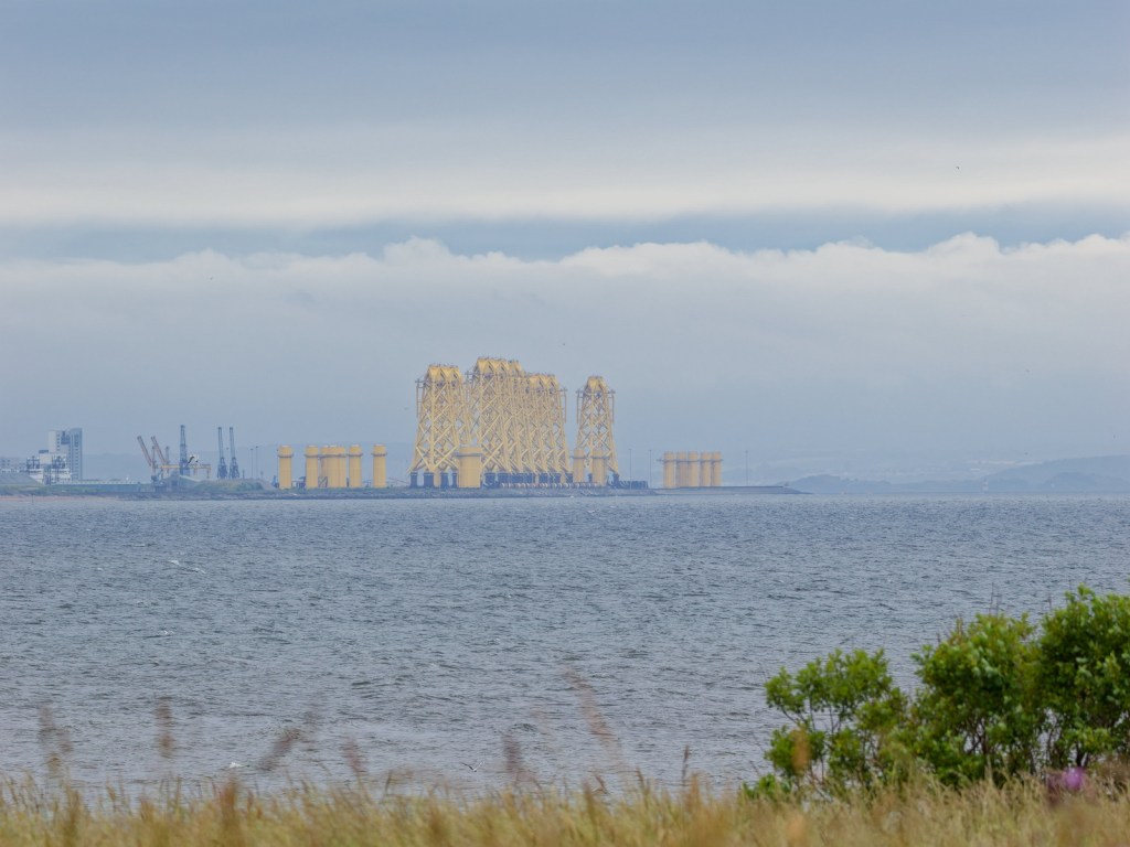
If you go pretty much anywhere with a view of the coastline in Edinburgh just now, you’ll see these huge jacket foundations dominating the skyline. They’re each about 80m tall, they’re bright yellow, and they’re impossible to miss. They’re also a dream subject for an urban photographer.
Yes, they really are huge. This is what they look like from Musselburgh Lagoons.
The colour is safety yellow – a bright shade with good visibility which is often used offshore so that they are easily spotted from a distance. In an urban context, they look staggeringly out of place.
Yes, the yellow really is that bright.
Surprisingly, unless you’re looking at them in the distance it’s quite hard to capture the sense of scale. Snapshots are easy. They’re right there, in your eyeline. They’re hard to miss. But they’re also quite distant, surrounded by dock buildings which themselves have little sense of scale. Yes, it’s a warehouse. But warehouses come in all sizes so it doesn’t really convey just how big they are.
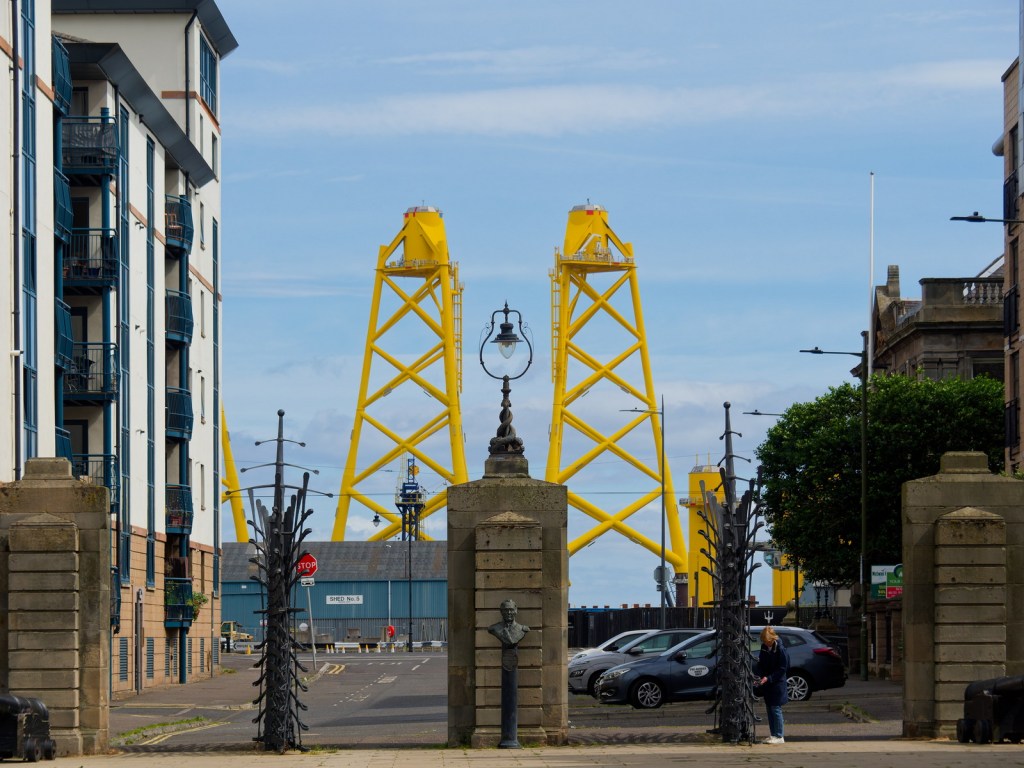
After a few attempts, I finally captured the sheer size of these foundations by stepping back slightly from the waterfront, using the more familiar architecture of The Shore to provide a sense of scale. They really are quite remarkable structures.
By photographing the jacket foundations as a backdrop to Victoria Swing Bridge and the adjacent block of flats, I managed to convey just how enormous they are
Picture the scene. A baking hot day. Bright sunshine. Deep, dark shadows. The sort of day that colour photography just doesn’t work, so instead you shoot black and white. Or even better, you shoot infrared black and white. Infrared-adapted cameras love bright, harsh sunlight. The sort of light that leaves you peering at the world even through darkly tinted sunglasses.
Of course on a day like that you never want to be too far from an air-conditioned café, so the best option is the city, right? Yes, the asphalt stores the day’s heat, there are too many people, and the buses all grind to a standstill. But at least the Place to Eat at John Lewis is cool, and you can find a quiet corner to regain your composure and plan the next set of photos.
That’s how it was on an August day in 2022 when I visited Old Calton Burial Ground, at the eastern end of Princes Street, Edinburgh, to photograph the cemetery’s historic tombs and lairs. Infrared cameras love cemeteries almost as much as they love harsh summer sun. Despite the familiar surroundings I was finding new angles, new compositions, new ways of seeing.
Even in daylight, most visitors to Old Calton Burial Ground stick to the highlights: David Hume’s Mausoleum, the Political Martyrs’ Monument, The Abraham Lincoln Memorial, and the views on Calton Hill and Salisbury Crags.
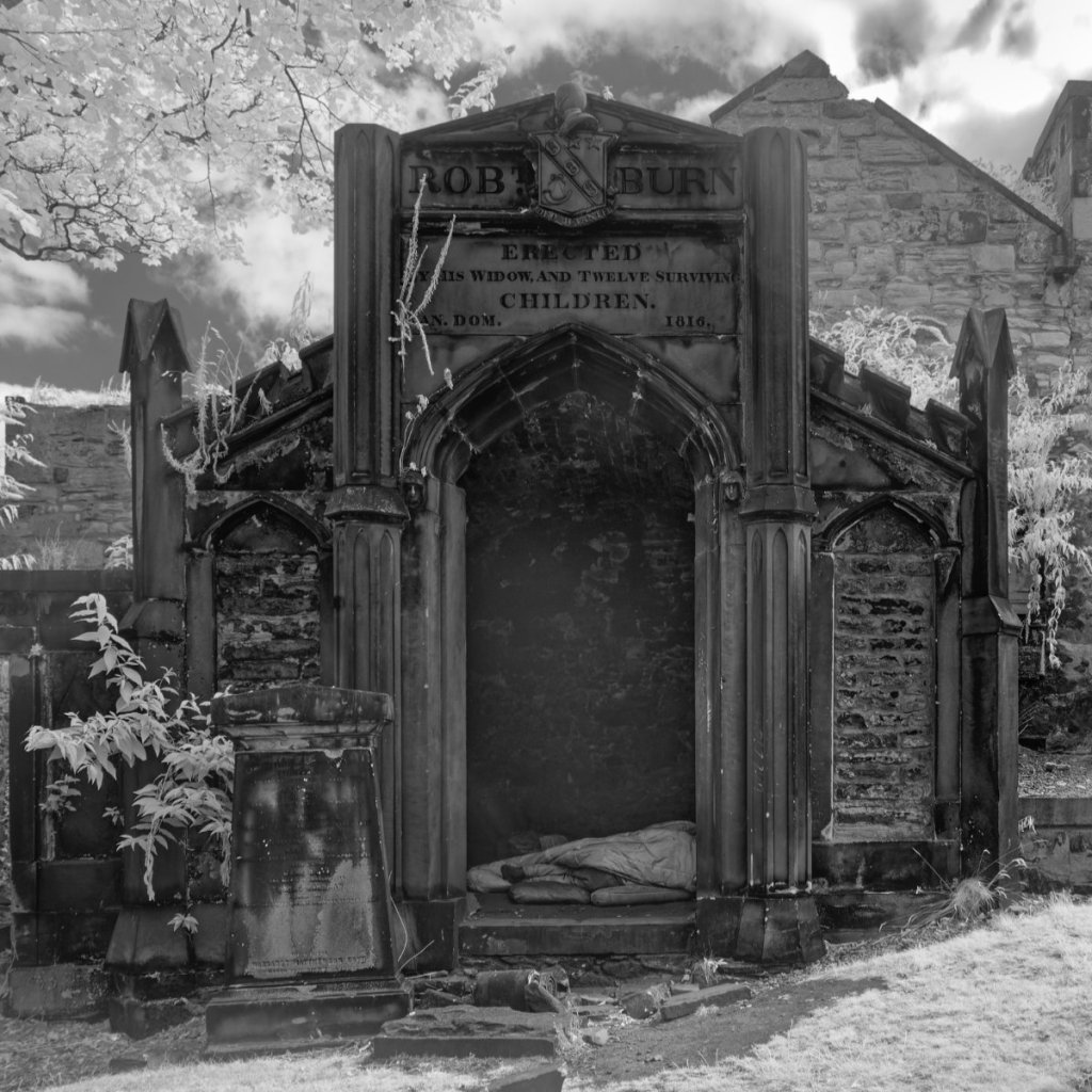
Step beyond those, ignoring the slight sense of menace even on this bright sun-drenched day, and you’ll come to the Robert Burn Mausoleum. On the day I visited, the mausoleum was unsecured, and I took the opportunity to photograph the open doorway. Only when I got home did I see the bedding on the floor and, to my shock, the legs of a homeless man sleeping away the hottest part of the day, hiding from the sun.
If I had noticed I would never have pressed the shutter. Photographing street candids is one thing. Photographing people experiencing homelessness is a step beyond – only to be undertaken in the course of serious journalism or documentary.
Having taken the photo I kept it private for a long while, trying to decide whether I could share it. And now here it is. What would you have done?
My camera group has been going out and about, every second Friday morning, for – oh, I don’t know, probably around 12 years now. You can imagine, even in a city as varied as Edinburgh, we’ve been pretty much everywhere. Usually multiple times. So a couple of years ago, around March 2024, we decided to start choosing themes for our photo walks. Themes are great. They encourage us to look at our surroundings with a fresh eye.
For a familiar location, having a theme can mean the difference between a boring morning – coming home with an original set of photos that you would never have thought of. Here are all the themes we chose in our first year of theme-based photo walks.
My camera group has its own blog. Why not take a look at how we interpreted these themes between February 2024 and March 2025?
The front page of the blog for the Edinburgh Ageing Well Camera Group
Symmetry
Yes it’s obvious, but after years of going out with our cameras on a Friday morning, this was the first time we had tried shooting with a theme. It’s an easy theme, and it worked predictably well.
History
This is a great theme for an urban environment. Photographing in Edinburgh’s Old Town, it was probably a bit too easy!
Spring
We chose this theme when visiting a garden in early April. The seasons are an obvious choice for nature walks.
Angles
We chose this theme when visiting an urban park with the cherry blossom at its best. It was a location we’d visited many times, and the theme prompted us to look beyond the obvious blossom and find compositions in the urban environment surrounding it.
Out of Place
Another theme that prompted us to think outside the box. Some people chose things that were obviously out of place – litter, weeds etc. Some people took props with them, photographing household objects which clearly didn’t belong in a country park.
Off-centre
This is a theme which can work in any environment. It obviously invites photographers to use the rule of thirds, but it also suggests some off-kilter compositions.
Flags
We chose this theme while visiting a small local harbour. There was bunting on display, and some of the fishing boats proudly displayed the Scottish saltire. It would be a good theme for an urban environment, forcing photographers to look beyond the obvious buildings and street scenes.
The Letter A
No idea how we ended up with this random theme but it worked well. People found the shape of the letter A in construction vehicles and in decaying trees. And of course in signage and advertising.
Doors and Windows
An obvious theme for visiting a church.
Transport
Bikes, cars, trams, even a distant telephoto shot of a cruise ship. A fun scavenger-hunt of a theme.
The Edinburgh Fringe
Seems obvious, right? You’re attending an event, so make the theme the name of the event. But street performers are the same all over the world. This theme invited us to place the street performers in context. Their location in Edinburgh was as important as their performance.
Black and white
Yes it’s obvious again, but for photographers who normally shoot in colour, it encourages tighter compositions.
Curves
We found curves in street corners, in decorative ironwork, in the chairs of a local café.
Dereliction
We chose this theme in an overgrown urban cemetery. It would be obvious in almost any urban environment, encouraging photographers to go behind the glossy facades and explore the back streets.
Red
The theme was suggested by our location for the day – an urban park with a war memorial, festooned with poppies for Armistice Day. But red was everywhere. A literal fire engine (no idea why!), berries, winter coats, and details from a children’s playground.
Motion
We found this theme surprisingly difficult. It should have been easy because we were on a busy street surrounded by movement. we really should try this again sometime.
Street
Surprising it took us so long to choose this theme. For a group of friends photographing in a busy city full of tourists and commuters, it could hardly be more appropriate.
Look Up
Another scavenger-hunt theme. You’re in a familiar location? Look up. See what you see.
Reflections
This a a location-dependent theme. We chose it when visiting a canal, but it would work equally well after heavy rain, or in a cityscape surrounded by glass skyscrapers.
Mindfulness can be an important part of photography. Yes, I’ve gone out to enjoy using my camera. Yes, I’m enjoying spending time with friends and looking forward to enjoying a coffee together. But alongside all the obvious skills of photography – considering the light, composing the scene, capturing the decisive moment – observation is the skill I keep coming back to.
It’s particularly the case when photographing a familiar location. If you’ve visited a garden many times, you know its secrets. You know what flowers are the most photogenic. What angles reveal the garden’s character. Where to stand to perfectly capture the characterful shape of that particular tree that everyone loves.
Sometimes, it’s very nice just to sit and observe. Place the camera by your side. Listen to the wind in the trees. The birds flying overhead. Enjoy the breeze through your hair.
Important, too, to acknowledge that the real world is never far away. Perhaps there are cars on the road outside. A gardener cutting a hedge in the distance. A fly buzzing past.
Sometimes – and more often as I ease into the less hurried world of retirement – I will spend as much time sitting as I do taking photographs. So yes, mindfulness is the word I need to use. And I didn’t arrive at it via meditation, forest bathing, yoga, or spiritualism. I’ve arrived at mindfulness simply through using my camera.
Duddingston Loch, Edinburgh, as seen from a bench in Jock Tamson’s Gairden. I spent a good twenty minutes here, just enjoying the moment. The photo captures the feel of the moment by defocusing the lens to concentrate on the shapes and colours of the scene.
In an earlier post, I talked about the importance of curating your photos – not just managing them. When you curate your photos, you bring them to life.
Instead of sitting in a Digital Asset Manager, or dying in a social media post that no-one looks at after the first 24 hours, in a digital photo frame your photos can live and breathe.
Hang on a minute. Digital photo frames are expensive, right? Well, yes. But if you have an old Android tablet lying abandoned in a drawer somewhere, almost all of that expense can be avoided. Here’s my workflow.
Step 1
Start curating the photos you want to display in folders. Folders are the key to this process. Not tags. Not star ratings, Not colour labels. Folders. If you come home from a holiday with 800 photos, you will need to pick out the best photos and move them into a folder of their own. This is your curated folder. This is what you are going to display. Think of it as a digital version of a photo album.
Step 2
Create a Dropbox account – free is fine – and copy your folders there.
Step 3
Go to an online electronics store (eBay or Amazon are the most obvious) and buy a right-angled charging cable for your Android tablet. This step is optional – but your tablet is going to be plugged in permanently, and that cable is going to look way more discreet if it just points down to the ground instead of sticking out.
Step 4
Find a stand for your tablet. You might have one already. Most folio stands work perfectly – all you need is to be able the display the tablet in an upright position. like a TV or computer monitor.
Step 5
Go to the Google Play store and install dfolio. Connect dfolio to your Dropbox account and it will enable you to configure a customisable slideshow from any image folder stored in your Dropbox.
Other apps are available, but dfolio is a mature app that works well and is regularly updated. The app will install as a three day free trial, so take advantage of the free trial to make sure it works exactly how you want. Once you’re satisfied, pay the unlock fee ($19.99 lifetime, or $3.99 per month at time of writing).
Step 6
Enjoy your digital photo frame. Your photos are now doing exacly what they’re supposed to do. Being enjoyed.
An old Samsung Galaxy Tab A being used as a digital photo frame
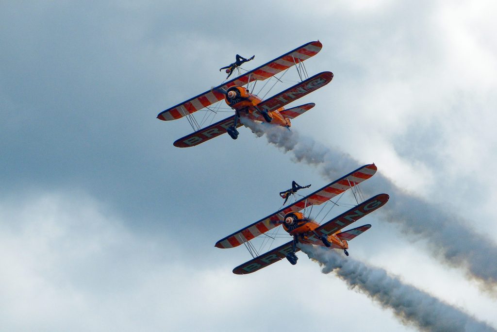
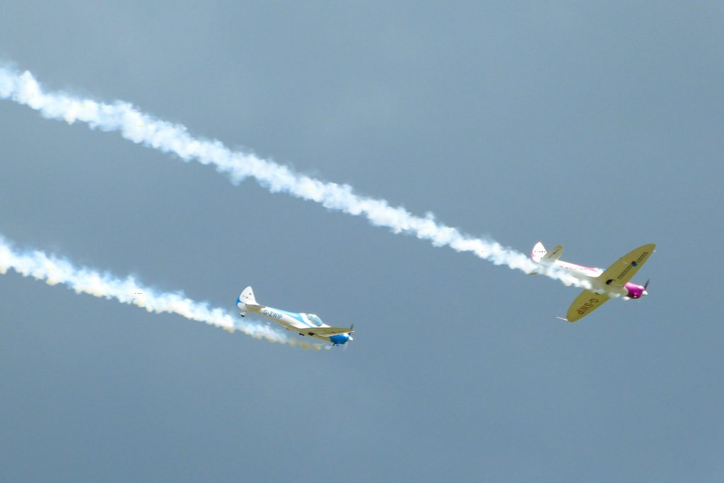
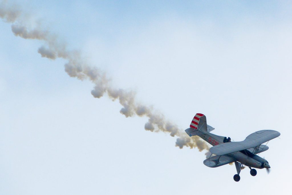
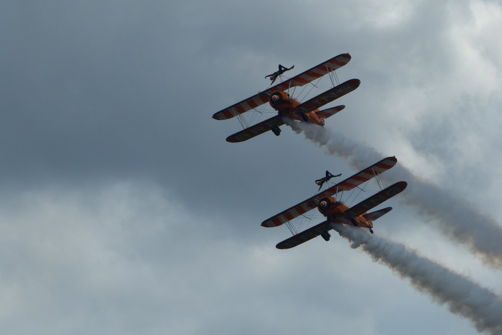
In 2013 I was using the Panasonic Lumix DMC-FZ150. It was a good camera. The small sensor was sensibly tuned for low noise with its 12 megapixel output. The Lumix colours were punchy without going over the top. The image stabilization allowed low light use without a tripod. All in all, one of the best bridge cameras you could buy in the early 2010s.
But with that 600mm zoom, like all cameras it was susceptible to atmospheric haze. And while the 1/2.3″ sensor supported RAW output my own preference – like most people’s – was to rely on Panasonic’s image processing and shoot JPG only. Usually this wasn’t a problem, but shooting an air show is one of those extreme situations where a camera needs all the help it can get.
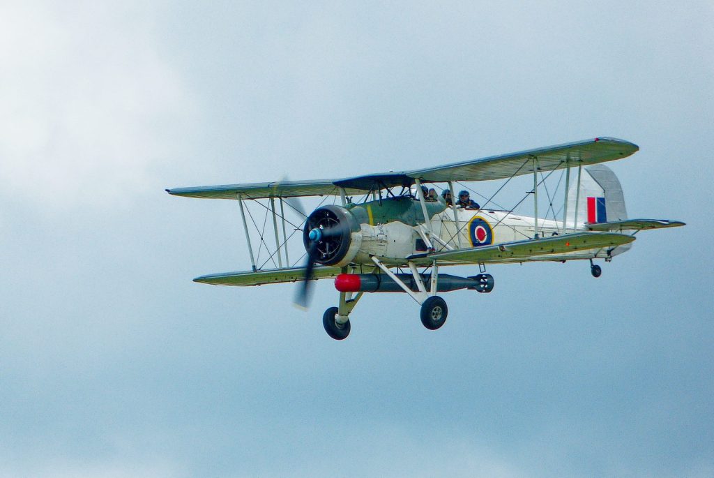
Reviewing a set of photos from an air show I attended almost 15 years ago, I was struck by three things. Firstly, because I was shooting dark objects against a much brighter background, the photos were all underexposed. Secondly, that atmospheric haze really wasn’t doing those old JPGs any favours. And thirdly, I’ve learned a lot about image processing in that time. It really wouldn’t take a lot of work to make those old photos sing.
So I took the photos into DxO Photolab and did some very minimal post-processing:
Increase the exposure slightly
Pull back the highlights to avoid clipping
Gently boost the shadows
Use the DxO Smart Lighting feature to reduce silhouetting
Mask the main subject and very add a small pop of Clearview
Slight blue saturation boost in the sky
Gentle crop
And that’s it. If it sounds like a lot of work, it really isn’t – less than five minutes total. I hope you like the results.
Not bad for a small-sensor bridge camera from 2011.
And just for comparison, here’s one of my edited images next to the original unedited JPG.
Once a fortnight, I meet up with a group of friends and we head out with our cameras to enjoy some photography. And of course coffee. We’ve been doing this for many years, so even in a city as beautiful as Edinburgh, we’ve photographed pretty much everything there is to see. Usually several times.
We’ve learned to deal with this by setting ourselves a theme. Nothing too ambitious, just a gentle prompt to help us see our surroundings in new ways.
So I found myself recently in Inverleith Park. This isn’t usually a fruitful venue for me. Many times I’ve walked through on my way from Stockbridge to the Botanic Gardens, and not even bothered to take the camera out of its bag.
This time was different. I had a theme. And so, armed with the thought that I was looking for “lines”, I found them everywhere.
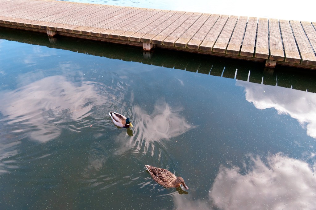
What I like here is the three groups of strong lines: the strong diagonal line dividing the photo into thirds, the parallel lines formed by the edges of the boardwalk, and the perpendicular repetition of lines separating the individual planks. Of course those elements aren’t the whole photo. The two ducks, floating through the clouds reflected in the smooth surface of the water, add an organic whimsy to the frame, contrasting with the strong geometry elsewhere. It’s a very satisfying image, but without the theme to work to, I doubt I would ever have taken it.
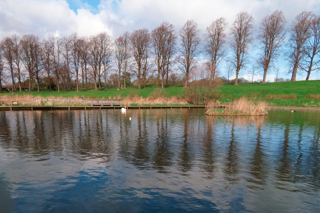
There’s maybe too much water here, but I was trying to capture the reflection of the line of trees on the horizon. Again there are multiple lines here. The pond’s edge provides a central line between the distant boardwalk and the wee island in the middle ground. Meanwhile on the horizon line, there are multiple lines of trees running in different directions.
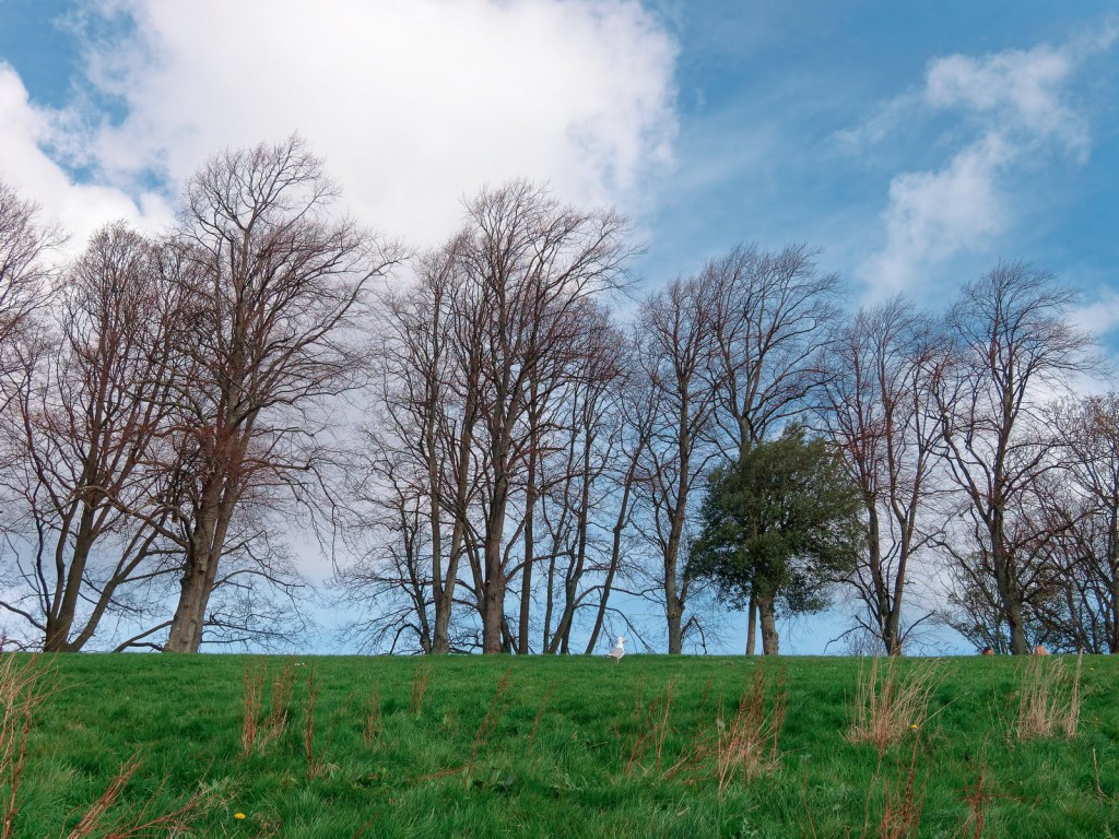
This is probably the only photo out if this panel that I would have taken anyway, even without the theme to guide me. It’s a very simple two layered composition with a strong line of trees echoing the image’s main compositional hook: the green horizon line which splits the images into thirds.
Overall, I was happy with my themed photo-shoot at Inverleith Park. The first image, of the ducks, was particualtlu successful. Strong colours accentuated by even stronger lines, all contrasting with the organic shape of the ducks floating in the clouds. And without the theme to guide me, I would never have taken it.
How do you manage your photos? You do manage your photos, right? Whether you use Digikam, Lightroom, ACDSee or even Windows Explorer, you have a system?
Maybe you organise your photos by date. One folder per month, or one folder per photoshoot. Maybe you completely ignore folders, relying on your DAM to keep them in order.
Maybe you keep your RAWs and JPGs in the same folder with the same filenames. Maybe you develop the RAWs and then discard them, preferring to archive the JPGs. Maybe you have completely different folder structures for RAWs and JPGs.
All of these are perfectly valid choices. What they all have in common is that they’re all file management. They say nothing about your art.
Managing your photos might mean keeping every photo you’ve ever shot, carefully stored in annual folders and backed up to three different locations. It might mean keeping a stack of 35 near-identical shots of a nesting bird, with the best shot carefully moved to the top of the stack.
Curating is different. It’s more subjective, it’s more subtle, and it asks some very difficult questions. Is this photo worth keeping? Does this image rely on other images to tell its story? Sometimes even – is this photo worth keeping?
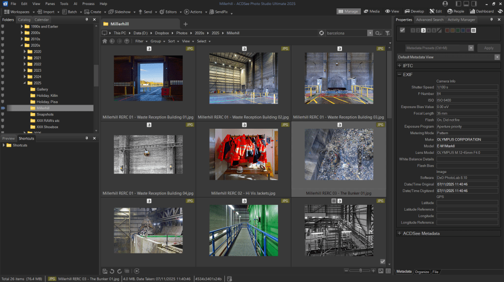
A screenshot from ACDSee showing a gallery of photos. Individually, these are just record shots. Viewed as a sequence, they tell a powerful story about saving household waste from landfill and using it to generate electricity. This is my final selection from a much larger photoshoot. Alternative photos, rejected photos, and RAWs are all stored in another folder.
For an analogy from analogue days, managing photos was about carefully filing the negatives and then stuffing the unwanted prints – still in their envelopes – into a sideboard drawer. Curating was about carefully selecting your favourite photos and placing them in an album.
In the digital era, managing photos is about ensuring that all your photographs are stored securely and that you know exactly where they are. Curating your photos is about understanding why you keep them and ensuring they tell the stories that are important to you.
So how do you do that? Social media is the obvious answer. Facebook galleries, Instagram reels. But the lifecycle of a Facebook gallery is measured in hours. Your friends might open the gallery when it’s first published, like a few photos, and then completely forget about them.
For a more permanent way of curating your images, photobooks are a great choice. Old-school photo albums work well too. (You do print your photos, right?) You can use anything, really, that turns your photos into a story.
For me, I use a digital photo frame. Or more accurately, an old Android tablet repurposed as a digital photo frame. You can read how I do that here.
I’ve lived in cities all my life, but living in Edinburgh is a completely different experience from the hustle and busyness of London’s West End. I was in London for a few days on business so my free time was restricted to an hour or so in the evening, before a rushed dinner with my colleagues and a swift return to the hotel to prepare for the next day.
I’ve always relied on my camera to unwind when I’m in a strange city. A gentle relaxed walk, camera in hand, documenting the novelty of a new day in a new town. What I wanted was a wander through St James’s Park, enjoying the autumn colours as the trees gently signalled the coming of autumn. With twilight giving the parks a slightly uneasy, ambiguous feel, I decided instead to photograph the relentless energy of the West End.
Making my way to Trafalgar Square I photographed all the cliché shots – the lions, the National Gallery, the water fountains. The photos were … okay. Record shots. Nicely done, and with the approaching blue hour giving great light. But ultimately they were snapshots.
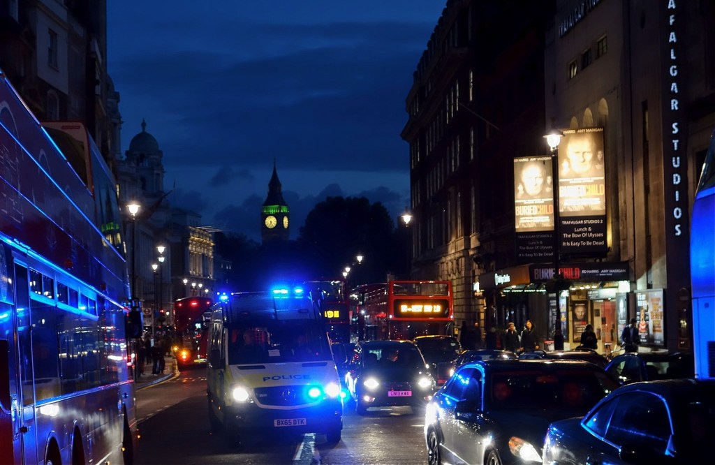
Making my way to the south side of Trafalgar Square and looking down Whitehall, a police van was making its way through the congestion. Blue lights flashing, sirens blaring. Of course drivers and pedestrians made way, allowing the vehicle free passage through the busy road. But no-one was particularly interested. In a large, heavily populated city, strangers are largely anonymous. Someone else’s emergency. Just one of thousands of emergencies that took place every day. And you couldn’t possibly pay heed to every one.
I often think about the incident this van was rushing to. Was this a big interruption for someone whose life continued normally the next day? Was it a life-changing moment for a whole group of friends and family?
The next day, of course, I was back in the corporate world and I gave it no more thought. Except, from time to time, when I look back at this photograph and wonder.
In my last post, I wrote abut the challenges of processing RAW files in ACDSee Photo Studio. The software has a great raw developer. The colour grading tools, in particular, are powerful and easy to use. But unlike many RAW developers, ACDSee Photo Studio doesn’t apply a default “look” to the RAW files as it imports them. In many ways this is a strength, leaving you free to decide exactly how you want the image to look. But it is also, on occasion, a weakness, increasing the amount of work you have to do to get a useable JPG from the RAW data.
To get round this challenge, I’ve started creating my own develop presets for my own most frequently-used cameras, starting with the Olympus OM-D E-M10 Mark II.
The Olympus OM-D E-M10 Mark II is a 16 megapixel camera, launched in 2015. This preset is designed specifically for that particular model, but should work well for any Olympus camera with a 16 megapixel sensor. In this post, I will:
Take you through the preset step by step, explaining why I have chosen those particular values and giving you all the information you need to replicate the preset
Explain the limitations of the preset, and what you will still need to do even after using the preset
Provide four example images, allowing you to directly compare the original Olympus JPG with a version processed using the ACDSee preset
Provide a downloadable copy of the preset
Give clear instructions for importing the preset to your version of ACDSee Photo Studio.
Sounds a lot, right? No worries, we’ll go through it step by step.
IMPORTANT NOTES
RAW developing is only available in ACDSee Photo Studio Professional and Ultimate. ACDSee Photo Studio Home does not have a develop module, and can not be used for processing RAW photos.
These instructions apply to ACDSee Photo Studio Professional and ACDSee Photo Studio Ultimate. They have not been tested in ACDSee Photo Studio for Mac.
What settings does the preset use?
General Tab
Exposure + 20
Highlights -26
These settings slightly increase the exposure, and then pull back the highlights to avoid clipping
Vibrance +10
Subtly increases saturation without affecting skin tones
Clarity +4
Improves local contrast
Light EQ adjustment
Pulls back slightly on the very brightest parts of the image, reducing glare for very bright scenes
Tone Curve
A gentle S Bend to gently add contrast
Detail Tab
Adds some subtle sharpening and noise reduction
Geometry Tab
Not used – see the explanation below
Lens corrections, and other things you will still need to do manually
ACDSee Photo Studio isn’t always very good at identifying the lens used for lens corrections.
Quite often, the lens identified in the View mode won’t be picked up by ACDSee in Develop mode. It’s a frustrating limitation which means that automated lens corrections in ACDSee Photo Studio can be a bit hit and miss. A much more reliable approach is to manually identify the lens in View mode (using the EXIF panel) and then manually select the correct lens for your image.
Important: remember to also select Vignette Correction in the Geometry tab.
Always remember that the settings used here are just a starting point.
Some lenses are sharper than others, so you may need to adjust the sharpness settings to suit your images
Photos taken at high ISOs or in low light, will contain more image noise, so you’ll need to increase noise reduction when this applies.
And remember to have fun. Presets aren’t “one size fits all” so tweak the settings as much as you want.
Example images
The ACDSee preset (left) is a little punchier, but the overall look of both versions is very similar.
The two images here are very similar. The ACDSee version (left) includes slightly more of the scene, due to differing lens corrections being applied.
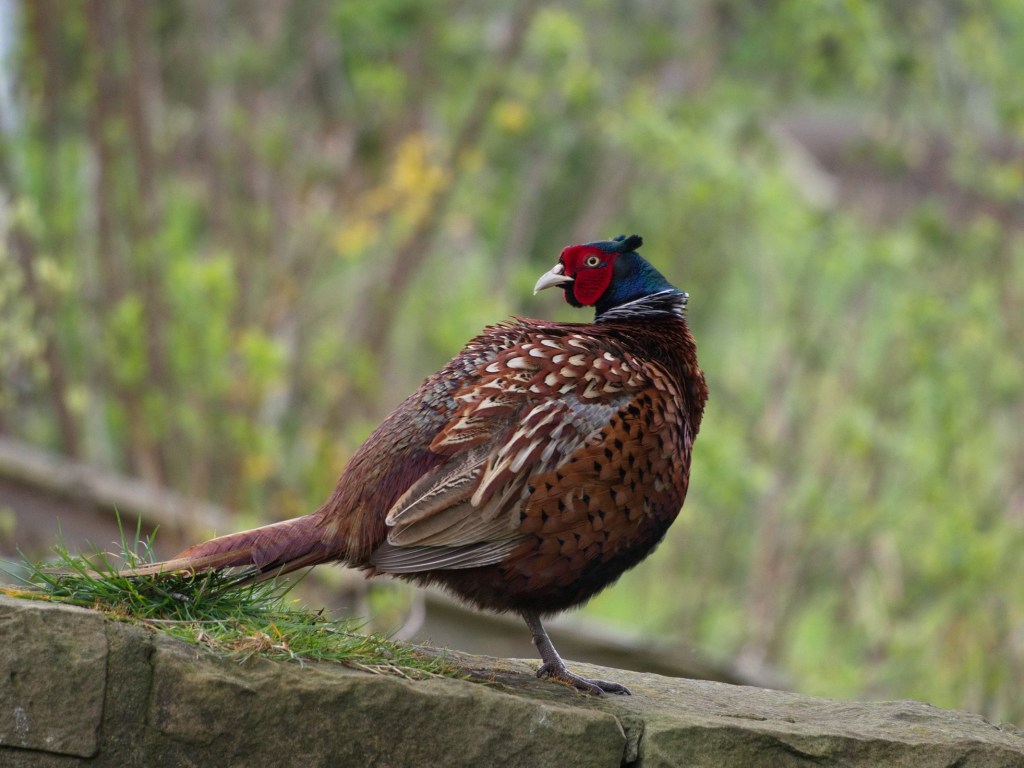
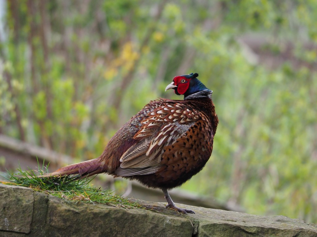
The Olympus version (right) is the clear winner here, with more accurate reds on the pheasant’s face. The ACDSee version would need further editing to match the Olympus colours.
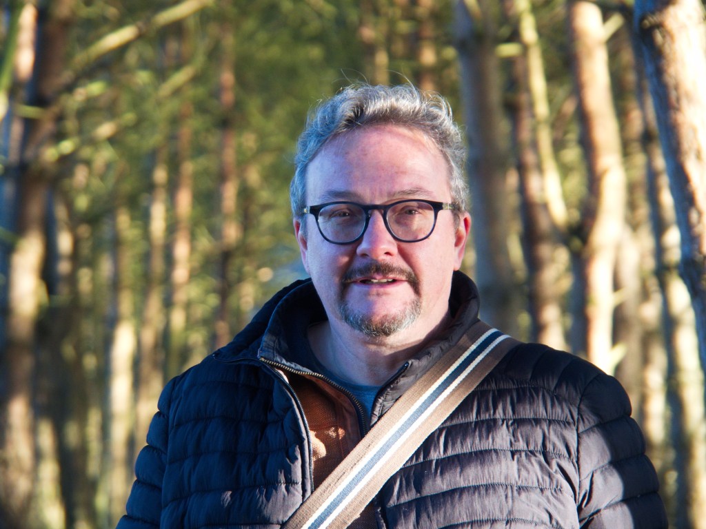
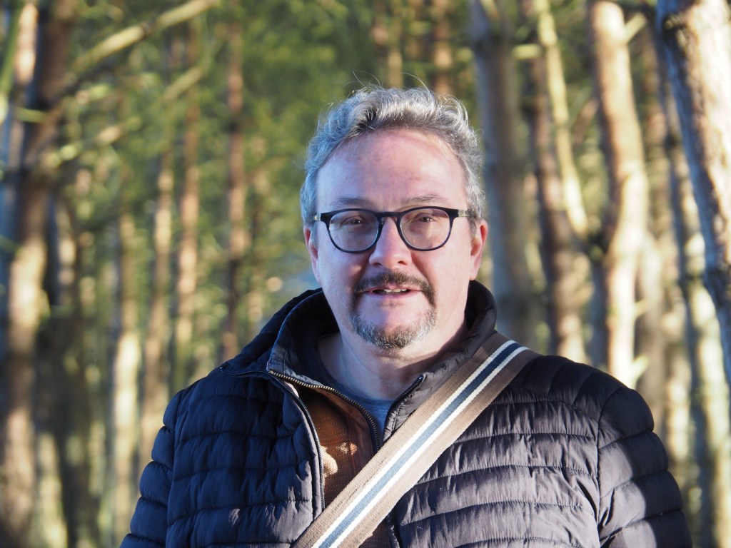
This time the ACDSee version (left) is the clear winner due to the increased clarity. Both versions need more work on the highlights to produce a more balanced image.