My Camera Stories

My photos and the stories behind them

  • RAW processing in ACDSee hits a little different than some other RAW processors. In most RAW software, the processing engine applies a default preset to the RAW file. In many cases, this immediately gets the photo to a stage where it’s usable.
    If you’re in a rush, you can import the RAWs, let the software apply its default preset, and immediately export the JPGs. Simple. Got a bunch of party snaps you want to share on FaceBook the minute you get home? Done in one. Just home from a holiday and want to quickly look through all your photos on your big-screen laptop? Done.

    Lightroom works that way. So does On1 Photo RAW, RAW Therapee, and DxO Photolab. Lots of RAW software works like that. But not ACDSee Photo Studio. In ACDSee you import your RAW files, and ACDSee does absolutely nothing to them.

    Of course, look in the Develop module and there are lots of presets in ACDSee. Look more closely and you’ll see that they work quite differently from the presets in most other applications.

    Sure, there are lots of presets, but they’re mostly designed around a specific task: add clarity, add a vignette, denoise, add punch. And again unlike other RAW developers, the presets are additive. Add a new preset and – unlike most software – it doesn’t replace the previous preset, it stacks on top of it.

    All of this behaviour is by design. ACDSee Photo Studio starts you off with a relatively neutral, low-contrast rendering rather than a punchy, ready-made look, so the image can appear a little flat at first. The upside is that you retain full control over how the photo is shaped; the downside is that if you want a quick, reliable starting point that will give you a usable result straight away, you’ll need to create it yourself.

    Well, I’ve been thinking about this a lot recently so over the last few weeks I’ve been working on a preset for the Olympus OM-D ME10 Mark II which acts similarly to the default preset in many other RAW developers. In other words, it’s not intended to directly mimic the straight out of camera JPGs. But it should be good enough to export usable JPGs if you need them quickly, and it will act as a starting point for more advanced editing when you have more time to devote to it.

    With minor tweaks, my preset could easily be used on RAWs from any of Olympus’ 16 megapixel cameras.

    In my next post, I’ll take you through exactly how I did that, and share the preset for download.
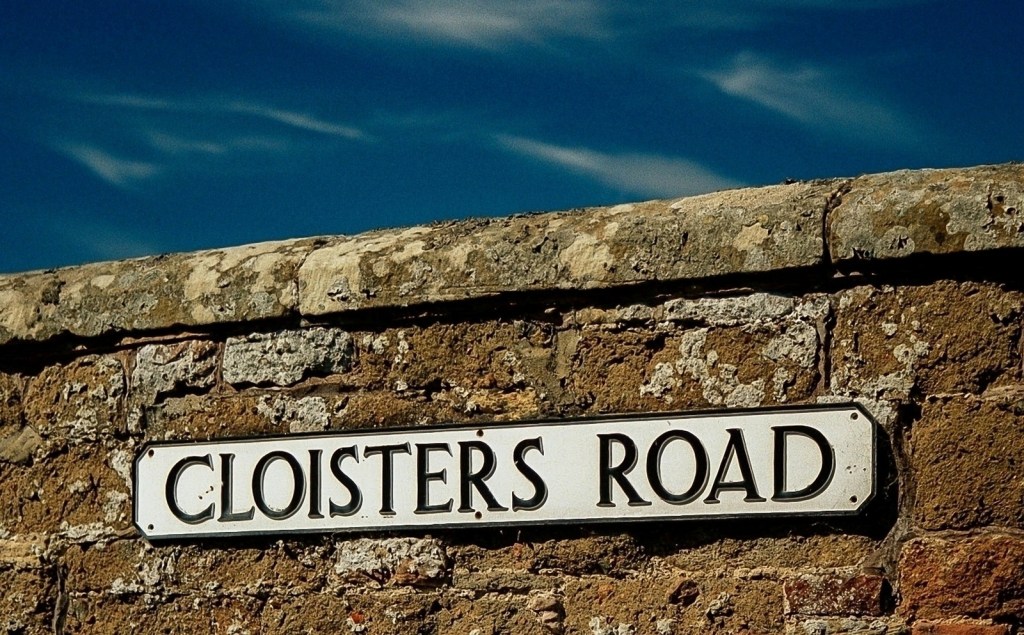
  • Back in the day, my favourite film to shoot with was Agfa Ultra 100. It wasn’t a subtle film. The colours were punchy, saturated, and – so far as greens were concerned – often quite unrealistic.

    This photo shows all the characteristics of Agfa Ultra. The deep cyan-blue, the warm reds in the masonry, the gentle roll-off of the shadows; and, crucially, the neutral white of the road sign.

    It also shows, even for Agfa Ultra, an intense level of saturation in the sky. Looking at that shocking blue, combined with the lack of any glare or reflections on the enamel sign, I’m pretty sure I must have been shooting with a polarising lens. The effect is striking, creating an almost surreal hyper-realism.

    Back in 2003 when I took this photo, there’s no way I would have done any editing on it. What you see here is the raw scan from the Kodak CLAS HR200 scanner which was used in the processing lab. Look closely at the EXIF and you’ll see it’s been saved in ACDSee, but that was a simple resizing exercise. No editing required.

    To answer my own question from the heading: how much saturation is too much? This is. I’d never saturate a digital image as much as this. Film though? Agfa Ultra gets away with it, by the skin of its teeth.

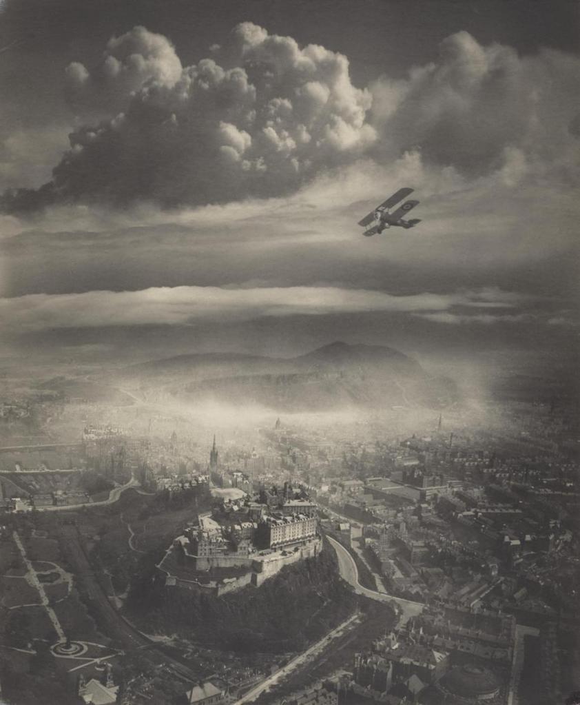
  • Alfred Buckham, Daredevil Photographer was the name of a photographic exhibition at the Scottish Portrait gallery in Edinburgh. If you don’t recognise his name, you’ll probably recognise his most famous photograph.

    Aerial view of a historic cityscape featuring a castle on a hill, with an old biplane flying in the sky and dramatic clouds overhead.
    Edinburgh, by Alfred Buckham, used with permission of National Galleries of Scotland.

    Yes, that’s a biplane flying over Edinburgh castle, with Arthur’s Seat in the background. Yes, it was before Photoshop was invented. No, it isn’t real – though I agree it’s very impressive.

    The exhibition was very informative about how Buckham created these collages, and it’s as straightforward as you’d expect. Take an aerial shot of a landscape and collage it with a separate photo of a big sky. Dodge and burn the join between the two images so that it looks like a single image. Cut out the silhouette of a plane from another photo and place it on top of the existing collage so that it all looks like a single, cohesive, whole.

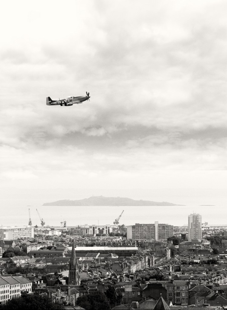
    Simple, of course, is a matter of degree. Yes, it’s easy to describe the technique, but matching the sky to the landscape, adding in the aeroplane, making it all look real is … challenging. I tried it in Affinity Studio – a powerful piece of software far in advance of anything available to Buckham in those analogue days – and my results were distinctly average. After several hours of work, nothing I tried would make the individual elements adhere together as a believable image.

    Yes, it’s collaged from three photos, just like Alfred Buckham’s photo. Yes, I took all three photos. Yes, you’re right, you can clearly see the join. Oh well, I had fun, and I’ve identified a project for a future rainy day.

  • North Berwick is a pleasant 35 minute train ride from Edinburgh’s Waverley Station. I go there regularly for the coffee shops, the busy high street, and of course the sea views. What I don’t go there for usually is photography, because the setting is all too familiar to me,

    Normally this isn’t a problem. Yes, form time to time I see things that make me think “that would make a great photograph” but that isn’t why I’m there. Relaxation, and a break away from the city, is my reason for being there. Occasionally though, a scene presents itself that just demands to be photographed.

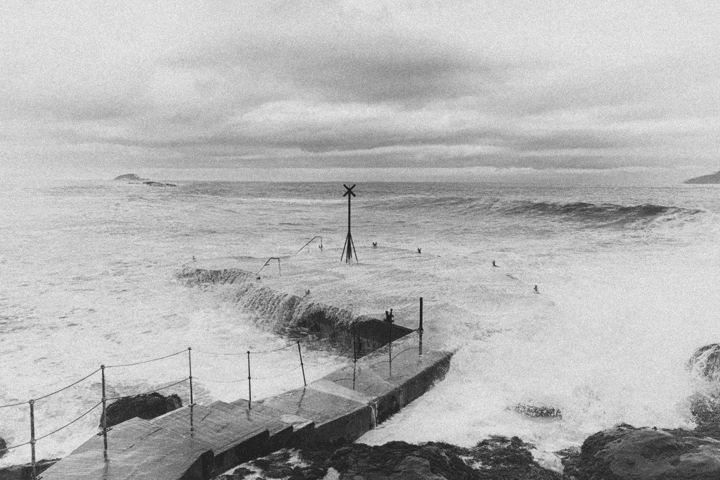
    That’s what happened when I was there earlier this month at high tide, on a day when the storm swell sent waves crashing over the Old Pier.

    What do you do in this situation when you only have a mobile phone? I braced my phone against a guardrail and shot a series of frames, timing them for maximum drama. Of course my very ordinary phone took a set of very ordinary photos but I knew there was something there.

    Arriving home, I selected the four most promising frames and imported them into Affinity Studio as an image stack. That’s where the movement of the waves comes from. By importing them into Affinity Studio as an image stack, the default “median” setting blurs and softens the movement of the water, creating a long-exposure effect that normally would require a serious camera with a tripod.

    Nice, but next time I hope I remember my camera. It’s a lot easier than doing it all in post.

  • With the weather being dreich and grey, my camera group today visited St Giles Cathedral, on Edinburgh’s Royal Mile. The theme was Texture. Whether that’s the same theme as Textures, or something different, is maybe something to explore another day.

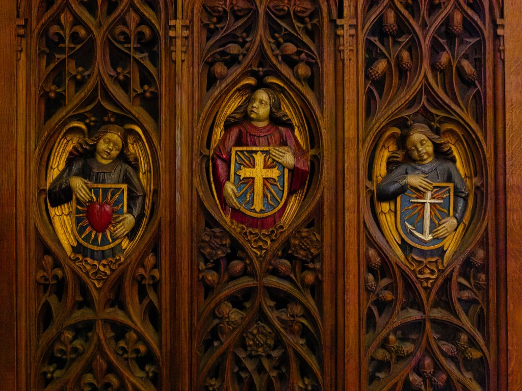
    St Giles Cathedral is rich in textural detail, and my Panasonic Lumix 12-32mm lens was ideal. Long enough to pick out detail. Wide enough to capture the grandeur of the building. This shot – of a decorative screen in the west nave – was intended to pick out the multiple textures of the carved wood.

    Oh, the textures are there. Subdued raking light picks out the surface relief of the carved oak – all the wee details of the oak leaves and acorns. The warmth of the light makes the gold leaf of the angels’ wings shine brightly and reveals the details of the carved feathers. The matte paint of the angels’ robes provides a counterpoint to the more obvious textures, a peaceful spot for the eye to rest. But my usual passion for symmetry has clashed with my intention to foreground the textural elements. Framed head-on, the story told by the three angels is about architecture, symmetry, and repetition. The photo captures how the scene looks, but it doesn’t invite us to lean in and explore the textures.

    For all that, I’m satisfied with this image of a detail that many people pass by without even noticing. Cathedrals are full of details like that.

  • Many visitors to Tuscany bypass the town of Pietrasanta. There is no single, iconic sight associated with the town. The appeal comes from small galleries and workshops. Temporary exhibitions of sculpture, usually featuring the local Carrara marble.

    And partly, perhaps, that’s because there’s no direct train from the main tourist hubs – from Florence, Cinque Terra, or Lucca, you will need to change trains at Viareggio or Pisa. But if you’re based in Pisa (which I recommend, by the way, for travellers exploring Tuscany by train) a simple 30 minute train journey takes you right into the heart of the town.

    We went there to view the exhibition Human Connections by Filippo Tincolini. Tincolini is a contemporary sculptor who mixes traditional craftsmanship with modern symbolism, often using humour and pop-culture imagery. And we were incredibly fortunate to be offered a guided tour by Filippo Tincolini and Laura Veschi, the photographer who has documented the human stories behind the sculptures.

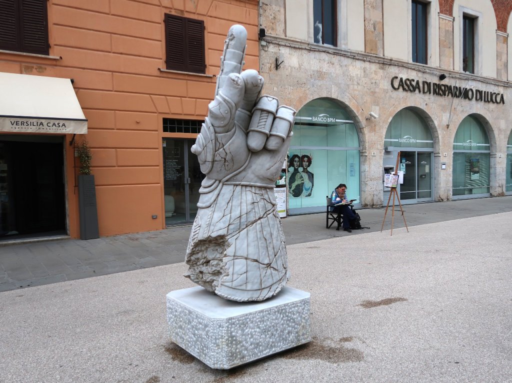
    Of course I took my camera – a small Canon compact – to document my own reactions to the artworks. My favourite piece of the day was Hand of Justice, part of Tincolini’s Ancient Gods series which uses modern superhero symbolism to recontextualise classical sculpture. But the first photo I took was very average.

    A large marble sculpture of a hand making a 'number one' gesture, set on a decorative base, with buildings and a seated person in the background.

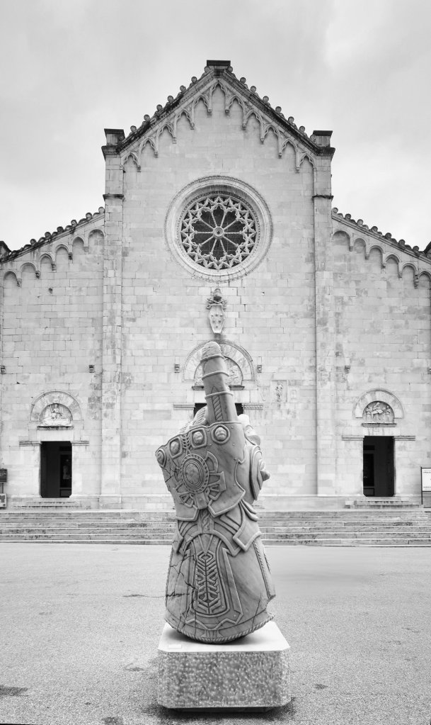
    I was attracted to this angle because of the sense of age around the base – the distressed marble cut away from the gauntlet- and the artist sketching in the background. It tells a story of two artists collaborating, or perhaps following parallel paths. But no, there was a better story to be told. Filippo put his hands on my shoulders – his English is no better than my Italian – and directed me to another angle where I was standing directly behind the Hand of Justice.

    From this angle, with the Church of Sant’Agostino in the background, the photo tells a completely different story. A story of defiance. Of conflict between art and religion. Of classical sculpture being used to tell modern stories. I wish I could take the credit, but it was the artist who, quite literally by sculpting my movements, led me to this story. It was a magical moment.

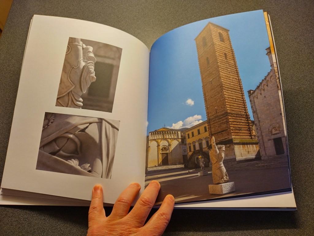
    Interestingly, the exhibition catalogue tells yet another story. It places the sculpture in the context of the piazza, which makes me reappraise the piece again. This time, I see it as a classical sculpture, reacting to the marble and the craftsmanship, and not to the artist’s intentions.

    An open book featuring two photographs of intricate sculptures on the left page and a view of a tall, historic bell tower and buildings in a square on the right page. A hand is seen holding the book.

    Three angles, three ways of seeing. Three stories.

  • It’s often overlooked, but ACDSee Photo Studio remains a great choice for many people looking to manage, process, and edit their growing photography collections. Since it was launched in 1994 (over 30 years ago!) it’s been continuously developed and updated into a mature DAM (digital asset manager), RAW processor, and layer-based pixel editor.

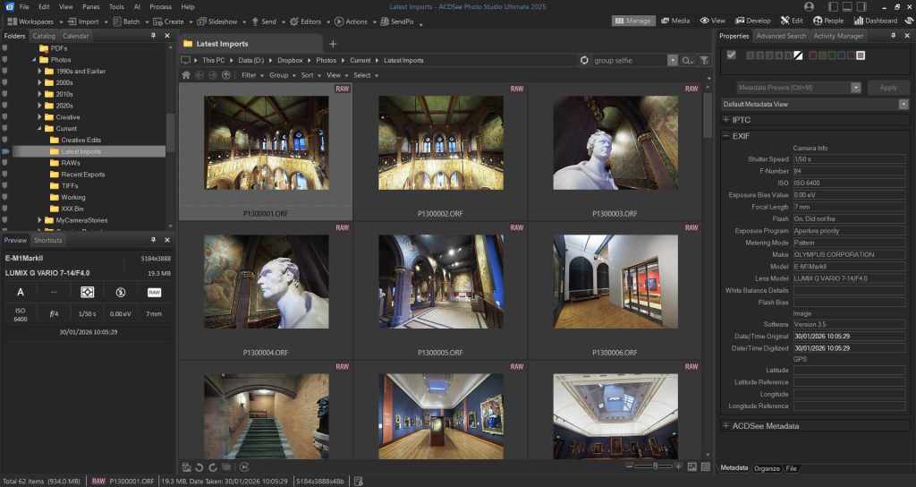
    A software interface displaying a grid of image thumbnails with details on the left and metadata information on the right, showcasing various images in a photographic editing application.
    ACDSee Photo Studio Ultimate 2025, showing the thumbnails from my most recent shoot

    The ACDSee website, as you would expect, does a good job of highlighting the differences between the various versions of ACDSee Photo Studio, but it also gets a little bogged down in detail. Looking at the big picture, this is my attempt to answer the question: what version of ACDSee should I buy?

    Just to be clear, this guide is for Windows users. There is only one version of ACDSee for Mac, and it’s called … ACDSee Photo Studio For Mac. But if you’re a Windows user, read on.

    ACDSee Photo Studio Home

    This is the cheapest and most basic version of ACDSee Photo Studio, and it’s a great choice for people looking to get a comprehensive photo management tool at a great price. If you fondly remember Picasa, and find yourself thinking “that’s what I want”, then ACDSee Photo Studio Home is the one for you.

    What you get with ACDSee Photo Studio Home

    ACDSee Photo Studio Home gives you a comprehensive set of tools for managing your photos, and a more basic set of tools for  editing them. You can view a wide range of photo formats including RAWs, and you can add keywords, tags, ratings etc.

    What you don’t get with ACDSee Photo Studio Home

    ACDSee Photo Studio Home doesn’t offer a RAW processor. The editing tools are basic, and there is no option to use layers when editing photos. And while there is a comprehensive set of tools for editing IPTC tags and EXIF information, you can only do this to a single image at a time. If you don’t need any of this – or if most of this paragraph just reads like gobbledegook – then stop reading now, because ACDSee Photo Studio Home does everything you need.

    ACDSee Photo Studio Pro

    The Pro version of ACDSee Photo Studio does everything in the Home version, with an additional set of tools for more advanced photographers. First up, there’s a powerful RAW processing engine. The AI presets are excellent, and the colour grading tools are some of the best available.

    The other big step forward is the improved metadata management. With ACDSee Photo Studio Pro, you can batch edit both IPTC and EXIF metadata. That’s ideal for changing the time in your photos if you’ve forgotten to adjust to local time when arriving at your destination. It’s useful, too, for adding GPS data to a batch of photos.

    What you don’t get with ACDSee Photo Studio Pro

    The biggest omission from ACDSee Photo Studio Pro is layered photo editing. For many people, this won’t be a problem. Affinity Studio (free) offers a comprehensive set of tools for layered photo editing. In my experience it’s more powerful and easy to use than versions of ACDSee which offer layered editing, and it integrates well with ACDSee Photo Studio Pro. For that reason, my recommendation for most photographers considering ACDSee is that they should buy ACDSee Photo Studio Pro, and partner it with Affinity Studio for those occasions when they need to use layers.

    ACDSee Photo Studio Ultimate

    The Ultimate version of ACDSee Photo Studio includes everything in Home and Pro, with the addition of layered photo editing. There are also some AI tools, which aren’t available in the other versions. In my experience, ACDSee Photo Studio Ultimate is the best choice for people who want an all-in-one solution.

    In fact, this is the version I bought last time I upgraded in 2025. Realistically, I over-bought. I never use the AI tools in Ultimate, and I prefer Affinity Studio over ACDSee for layered editing.

    If you see yourself regularly using the AI tools, or if you really want to avoid having to use two separate apps, it’s a great choice. But for most serious hobbyists, my experience is that ACDSee Photo Studio Pro, plus Affinity Studio is a better option.

    What about Gemstone?

    ACDSee Gemstone is purely a layered photo editing tool, without any of the photo organising tools offered by ACDSee Photo Studio. Personally I prefer Affinity Studio, but your mileage may vary.

  • I have cataracts. Of course there’s nothing unusual about that for someone of my age and I’m fortunate that, at least for the moment, it makes relatively little difference to my life. But I need extra light for reading, and I often struggle when trying to identify birds at the extremes of my binoculars’ magnification.

    My photography, mostly, is unaffected. Modern autofocus lenses achieve a far greater degree of sharpness than those split-prism viewfinders that I grew up with, and the live view histogram on the back of the camera ensures that my exposure is spot-on even in the most difficult light. Processing my RAWS, I suppose that colour grading could be troublesome, but since I tend to prefer the native Olympus colours anyway, it’s something I do to only a fairly limited degree.

    Getting the contrast right in the scene can be more challenging. One of the effects of cataracts is to reduce the micro contrast of some scenes, and I’ve learned to dial the contrast back slightly from my preferred settings in order to achieve a realistic effect.

    One effect of cataracts that I’ve particularly noticed is their tendency to create a halation effect – a warm glow, effectively – around the highlights of a scene. I try to use this to my advantage. I enjoy the slight halation that you get from vintage lenses, and I often try to replicate it when editing an image.

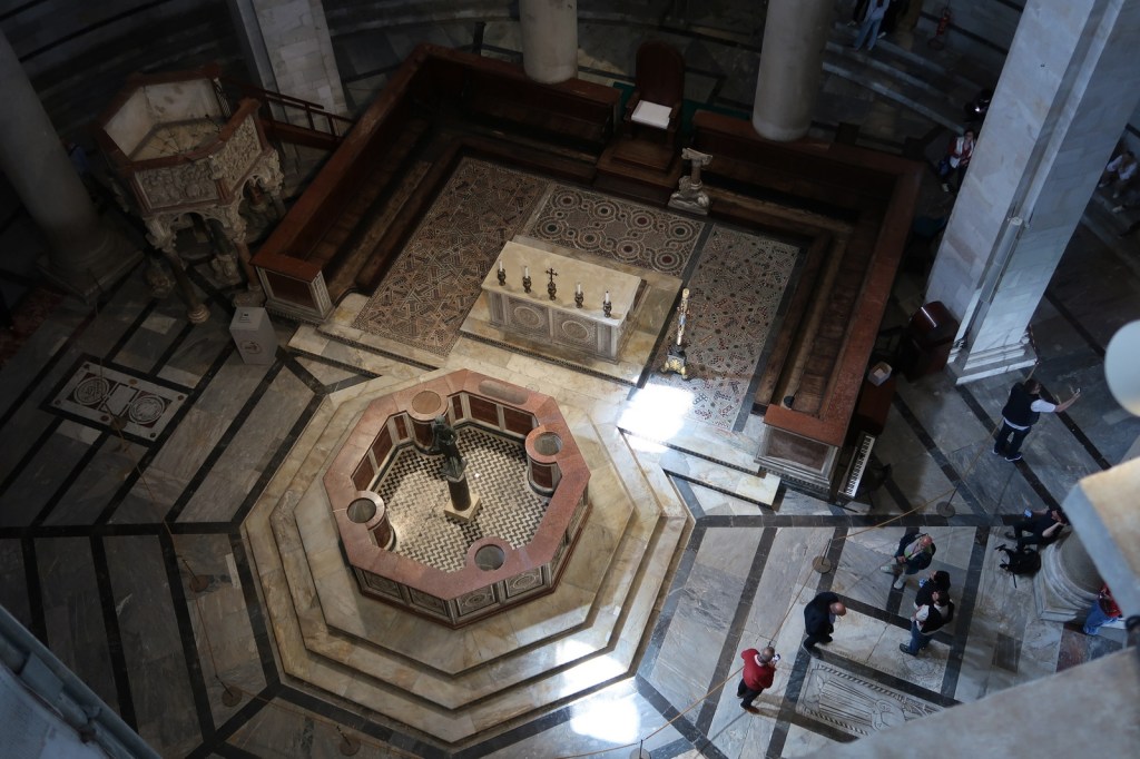
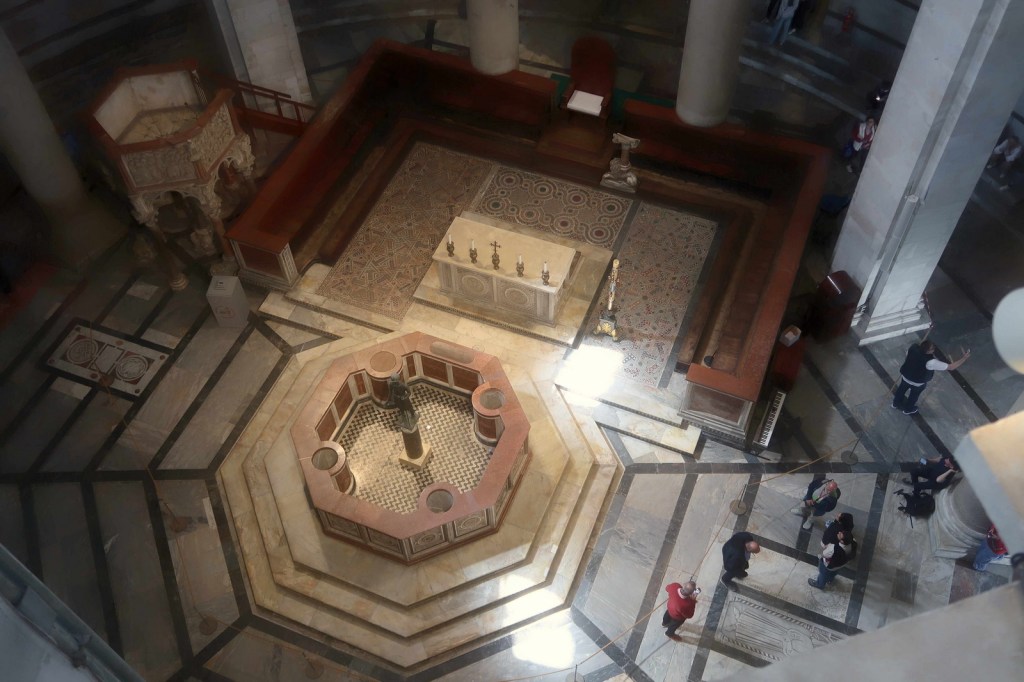
    All of which led me, recently, to try to replicate what it feels like to see the world through cataracts. I chose a photograph I took in the Baptistery at the Piazza dei Miracoli in Pisa. There’s a strong element of dark and light in this scene which makes it easier to see the highlights glow, and the disorienting effect of looking down on the scene adds an element of abstraction. The detailed textures, too, allow me to demonstrate the impact of reduced contrast.

    The edited version – trying to replicate a slightly exaggerated view of how I see the world – makes a few changes to the original photo:

    • The contrast in the mid tones has been reduced
    • The colour balance has been adjusted gently to warm the image
    • The colour balance around the highlights has been further warmed
    • The highlights have a gentle glow around them
    • The microcontrast has been reduced – this can be seen particularly in the textures of the tiled floor at the top left of the photo
    • Slight vignetting

    To be clear, this edited photo is intended to represent the world as seen through my incipient cataracts. The effects of mature cataracts are far more extreme, and hopefully I’ll have my cataract surgery long before I reach that stage.

  • If you’re anything like me, most of the time you don’t even think about white balance. Set your camera to auto, shoot away … and the results are exactly what you expect. Sometimes your camera gets the white balance wrong, and that’s OK because DxO, or ACDSee, or whatever you use to tweak your photos can easily fix the error in just a couple of clicks.

    But what about when your camera gets it wrong?

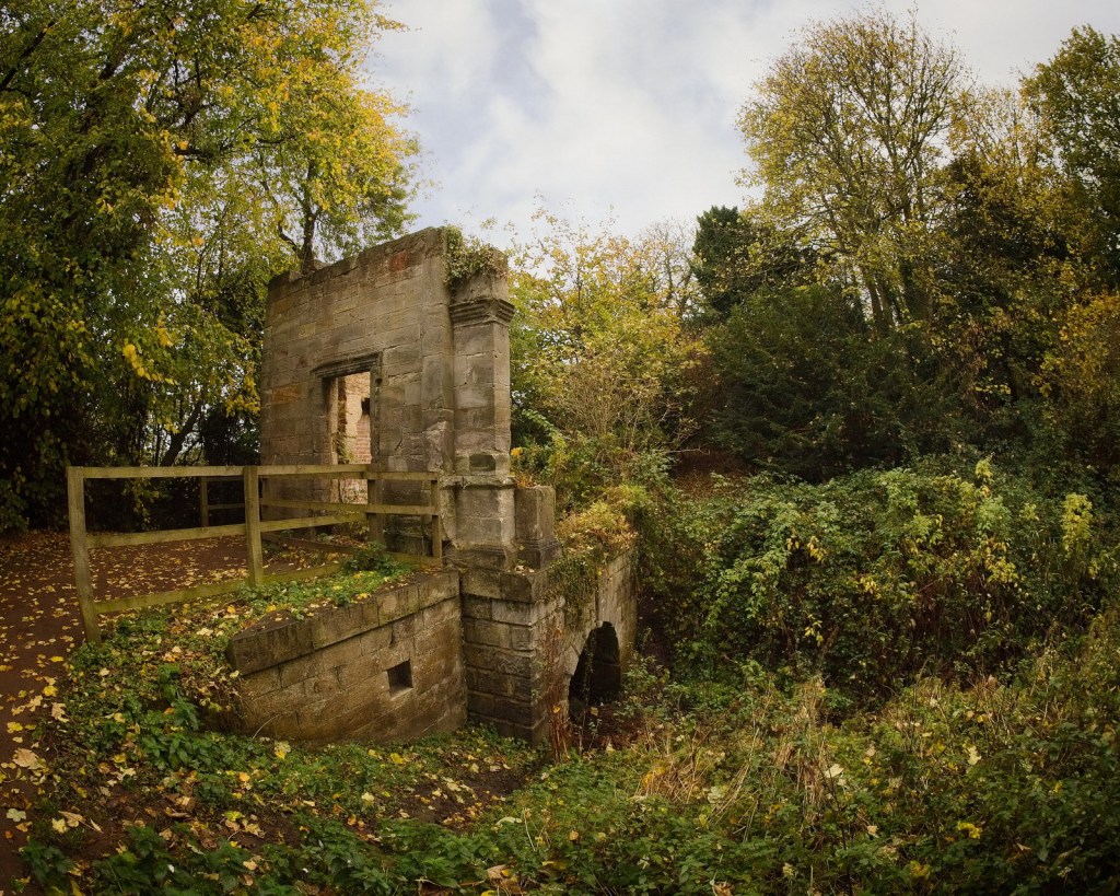
    The first version of this image is straight out of camera. The white balance is objectively wrong. There’s a yellow cast that knocks the whole colour balance off, and yet the photo works. The image feels old, as befits the subject, and the romance of the golden hue accentuates the feeling of lost grandeur.

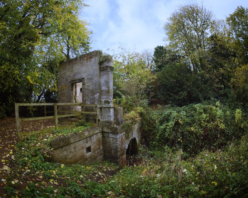
    With the white balance corrected, the second version of the same photos just feels dull. More accurate, maybe, but totally lacking any sense of romance or history.

    The subject of this photo is the old Tea House in the estate at Newhailes House, East Lothian. I’ve photographed it many times, but I’ve never replicated the magic that I captured with an old Olympus PM1 and Samyang fisheye lens.

    Newhailes House is owned by the National Trust for Scotland. There’s a charge for parking, and a further charge to visit the house, but the grounds are free to explore. Why not take the bus instead? LRT buses 26, 44, 113 and 124 all stop just a 5-10 minute walk from the main entrance.

  • What’s all that about then? Dig into the menus of your Olympus camera, and you’ll likely find two different options for auto white balance. There’s the regular, default mode, and there’s another mode that says “keep warm color off”. Now, much as I love Olympus – and I’ve been shooting Olympus for long enough to be very comfortable with their complex menu options – I must confess it took me far too long to explore this one.

    Turns out it’s really straightforward. In its default (“on”) setting , your camera will try to retain a warm colour balance even under warm lighting conditions such as candlelight, tungsten, or incandescent lighting. Most of the time, this is exactly what most people want – hence the sensible decision by Olympus to default the setting to “on”. But sometimes, when you want a more neutral white balance, turn the setting to “off” and you’ll get a more accurate, albeit less romantic, colour balance.

    The setting only affects JPGs. If you’re shooting RAW, you can completely ignore the menu option and select white balance in your raw editor like you always do. I told you it was straightforward!

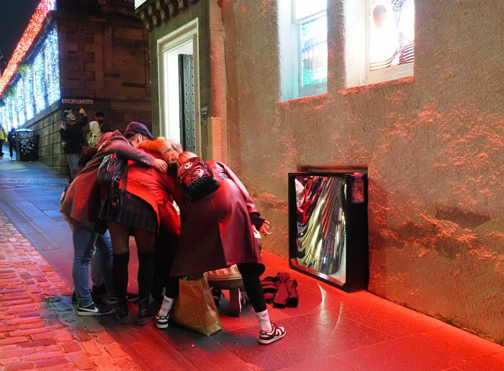
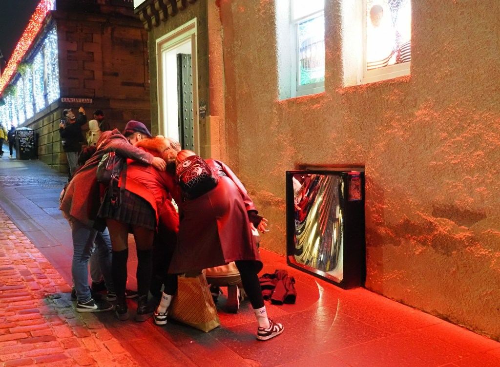
    Look at the white wall. In the first image (keep warm color off) the white wall looks fairly natural. You can see the red lights reflecting off of the rough surface, but you can also see the natural white colour of the wall. The difference is subtle but I think this version has a more documentary feel.

    In the second image (keep warm color on) the street lighting bathes the white wall in a warm glow. I think this version of the photo has a more “snapshot” feel.

    As ever with photography, there’s no right or wrong here. I usually leave this setting defaulted to “on”, and only switch it off when I’m aiming for a more journalistic style.