One of the pitfalls of autopainting software is its tendency to be literal. If a detail is in the photo, the programme includes it. If the photo is under or overexposed, if the horizon is squint, or if the buildings have converging verticals, then all of those elements will be carried forward into the finished picture. To address this issue, I’ve developed a workflow that makes the original photo look less photographic before I take it into my autopainting application.
Here’s a comparison so you can judge for yourself. The version on the left has been painted from my edited photo. The version on the right was created from the original painting.
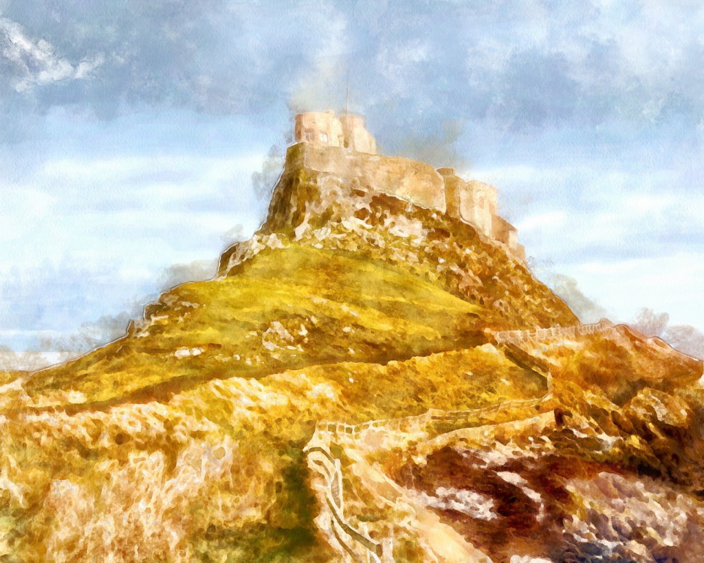
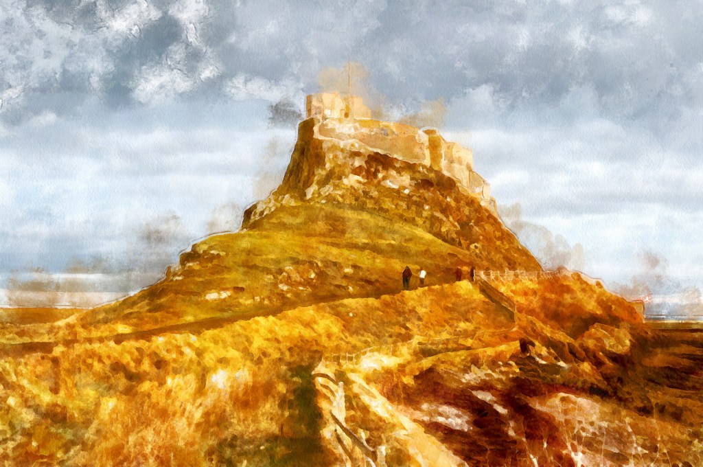
The most obvious difference is in the sky, but notice also how the path in the edited version feels more hand-drawn, the distracting people have disappeared, and that awkward texture at the bottom right corner becomes easier to read as solid ground.
I use Affinity Studio for this workflow, but almost any photo editor will do the same job just as well.
The original photo
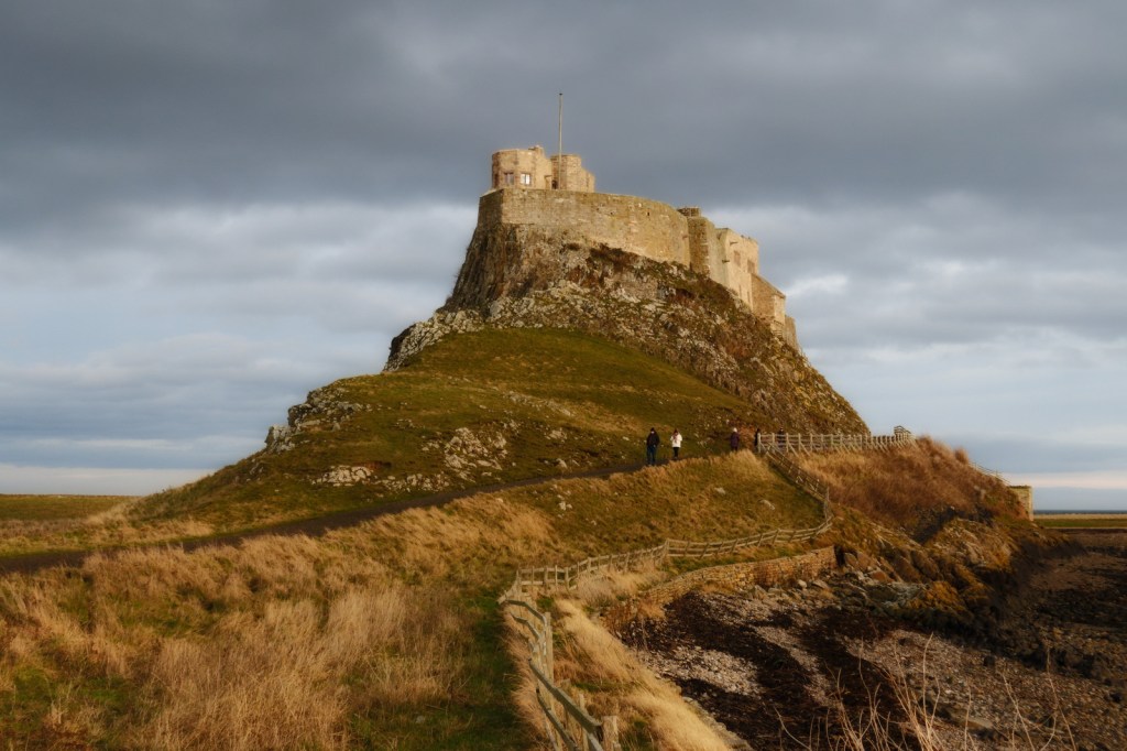
Lindisfarne Castle, Holy Island, Northumberland
Step 1 – basic editing
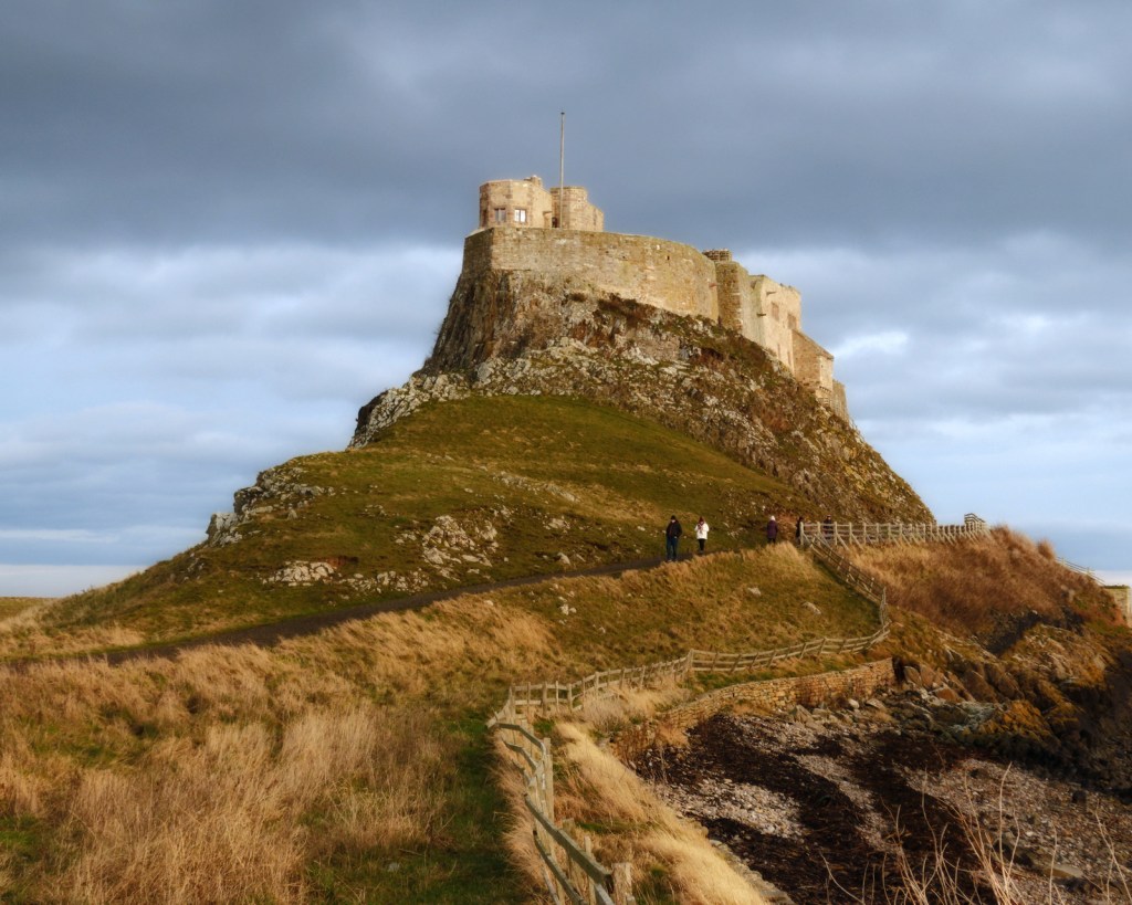
Start with basic editing. Get the white balance and exposure correct. Level the horizon. Correct the geometry if necessary.
Think about what aspect ratio you want your finished picture to be. 5:4, 4:3 and 3:2 are all excellent choices. 1:1 (square) can also be very effective. Avoid non-standard aspect ratios unless you’re aiming for a special effect.
This photograph has needed very little work at this stage. I’ve cropped it to a 5:4, ratio, boosted the exposure by about a third of a stop, and slightly cooled down the white balance.
Step 2 – Remove distractions
If you were paining a real watercolour you wouldn’t paint every single detail you see in front to you. So this is the time to remove those unwanted details from your photo.
The sort of things you might remove are: background people; street furniture; cars in the background, and anything that “jars” with the subject that you are wanting to paint. Your objective at this stage is to simplify the composition, the way an artist would if they were sitting with their easel looking at the scene.
Here, I’ve removed the people on the footpath, and tidied up some intrusive branches that were dominating the bottom-left corner. There’s no need to do a perfect job, because this isn’t the version that people are going to see. Any messiness that you see here will disappear once the scene is painted.
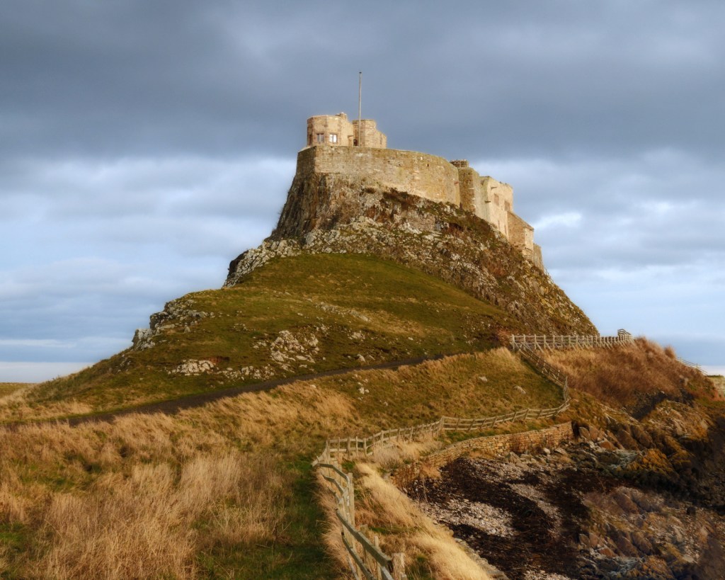
Step 3 – think about shapes and colours
This is where we start to make the image less photographic.
Duplicate your image onto a new layer and apply a gaussian blur. This will start to break down the image into blocks of colour. For a 20 megapixel photo, start around 1-2 pixels, and then adjust as necessary. Larger or smaller photos will need more or less blur. (I used 1.4 pixels for this 16 megapixel image.)
Now zoom into 100% and look at your image again. Think about the detail you need to keep. If the gaussian blur has caused you to lose that detail, back off and reduce the amount of blurring.
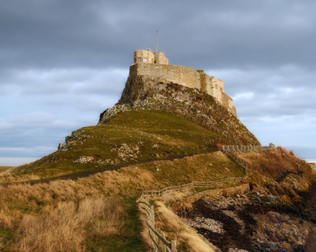
Step 4 – introduce geometric irregularity
That path is too straight, and the flagpole is even worse. Leave it as it is, and the finished painting will look like it’s been drawn with a ruler. So the next step is to introduce some geometric irregularity to the photo, to make it look like it’s been drawn by an imperfect human hand. In Affinity Studio, the best way to do this is with the mesh warp tool. Be subtle – you don’t want the photo to look like it’s been drawn after a long drinking session. You’re just looking for something a little less geometric.
Take care at this stage. Don’t introduce too much change. Just enough to make the image look less geometrically precise.
And if you have buildings that look like they’re falling over, this is your last chance to sort them. They’re a dead giveaway that a painting has been drawn from a photograph.
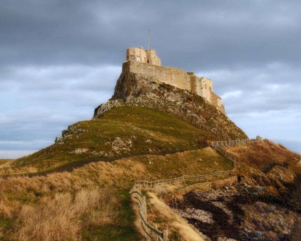
Yes, I know the flagpole looks “off”. Trust me. It’ll look way more natural after the last step.
Step 5 – tonal grouping
Don’t skip this stage – it’s a basic building block that will make your photo look more painterly. What you’re doing here is creating individual masses of colour, instead of the continuous range of colours captured by the camera.
Start by creating a new layer. In Affinity, use the merge visible command to do this.
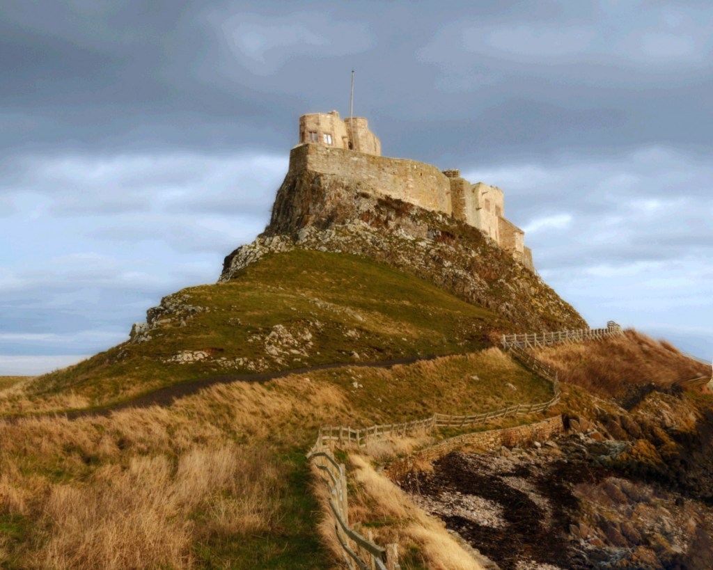
Use the posterise filter. Yes, it will make your photo look horrible. But by reducing the number of colours that your painting application has to work with, it makes its job much easier.
I’ve used 32 levels of posterisation here, backing off just as the sky started to break up.
Step 6 – final tweaks
Now step back and ask yourself if the photo will work as a painting. Here I decided that the image was oversaturated, and the foreground was slightly too dark. A slight curves adjustment, and reducing saturation by 15%, addressed both issues.
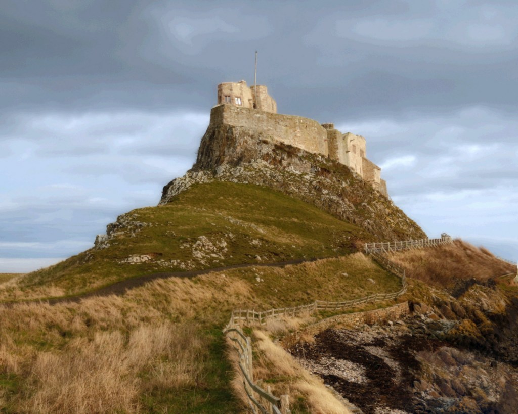
Step 7 – simplify the edges
This is very similar to Step 3, where we applied gaussian blur. The aim here is to soften the shapes before they are painted. Start with about half as much gaussian blur as you applied at Step 3. Zoom in to 100%, and then zoom out to full screen, before making your final decision.
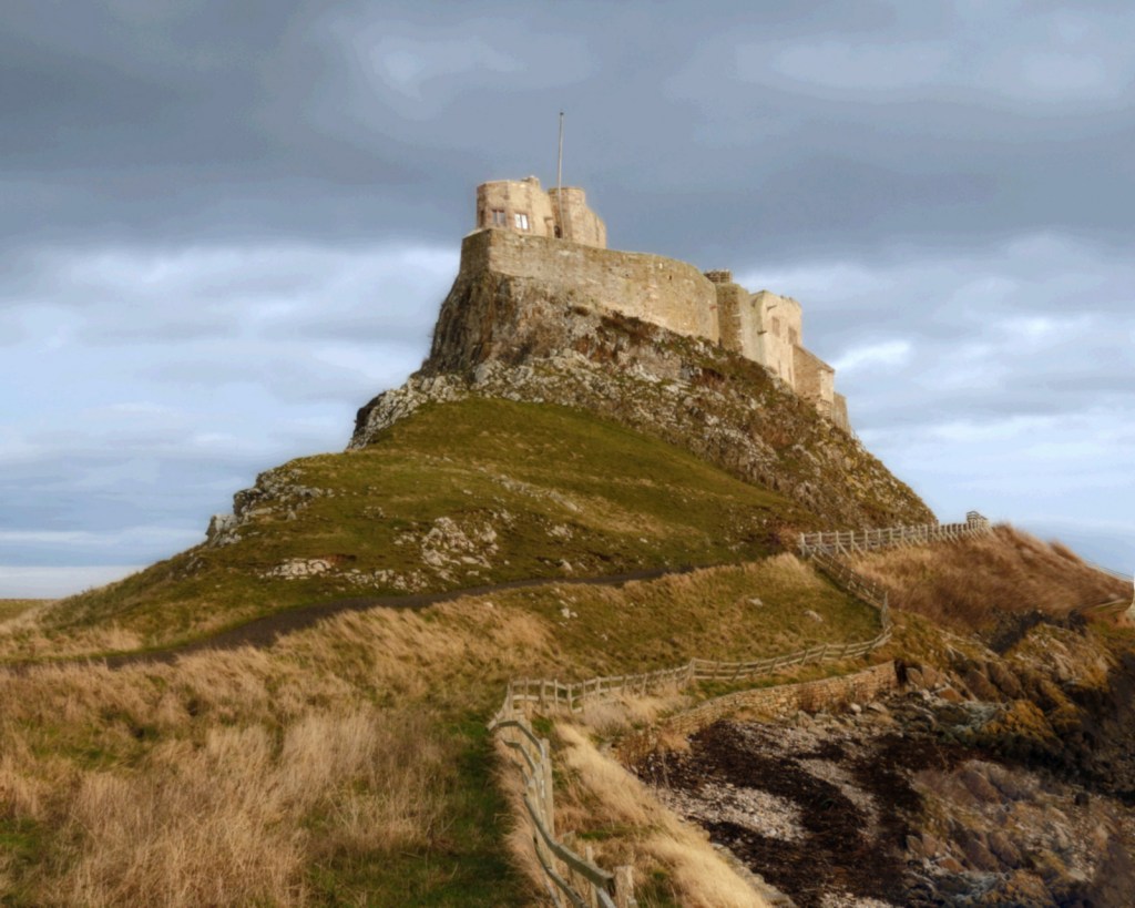
The blur here has been very subtle – just 0.5 pixels.
And we’re done. The image is ready for autopainting.
The result
And here is the final result, painted using the Aqua Real – Textured preset from Dynamic Auto Painter 7. In my next post, I’ll paint this same photograph using other autopainting software, to demonstrate some of the alternatives to Dynamic Auto Painter that are available for Windows.

 My Camera Stories
Leave a comment